The field of data analysis is an extremely wide ranging and large one. Indeed there are so many aspects to data analysis, that it would be impossible for any one individual to become an expert in all of its specialties.
That being said, any analyst who is working with geographic data of any sort, should be aware of GIS and its influence on any analysis being carried out. While other forms of analysis can be carried out without a geographic component, GIS analysis allows an extra dimension to be examined and analysed.
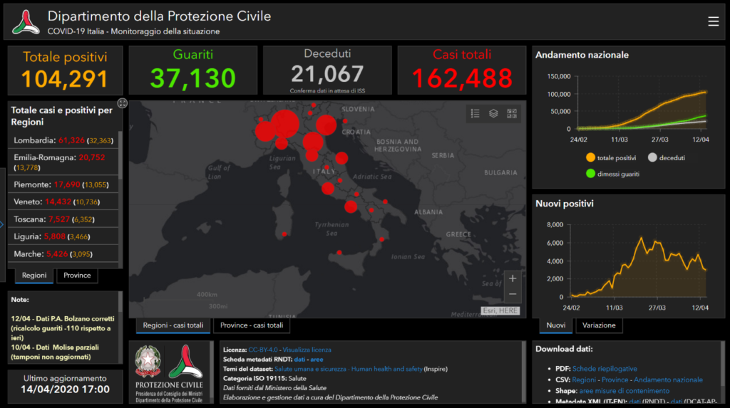
An interactive dashboard or graphic can be useful for demonstrating some information, but without data broken down into geographic regions, then some important insights may be missed. A geographic dashboard can display rates of disease or vaccination by area, allowing analysts and users to see whether there is a geographic component to these questions, and to then ascertain if there is another link, such as ethnicity, language or culture, which may explain a lack in vaccination uptake.
GIS skills are especially useful for Data Analysts working in healthcare. At the start of COVID-19, there were several geographic dashboards, showing the spread of the disease as well as the spread of fatalities.
There are also ethnic groups, who are more susceptible to certain illnesses, examples of which include the Afro-Caribbean population, who are more likely to suffer from sickle cell anaemia, and people of Polish descent, who have a higher breast of breast cancer and ovarian cancer. By understanding where these groups may live within a large city, can enable a higher level of bespoke medical treatment to be made available to them.
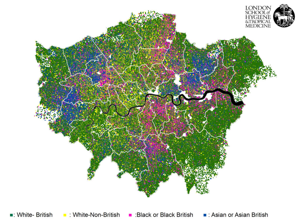
Using limited resources in targeted areas would improve the healthcare of those susceptible to genetic illnesses, while allowing efficiencies to be made by limiting the wastage of resources for populations, who have less of a requirement for them.