The Problem of the Ageing Digital Infrastructure of the NHS

The NHS is currently facing a critical challenge with its ageing digital infrastructure. Attempts to implement a centralised patient record system, which would enable access to patient data across all NHS locations, have been fraught with difficulties.

A number of issues contribute to this problem: incompatible IT systems that cannot communicate with each other, outdated infrastructure, delayed correspondence due to inefficient systems, inconsistent IT setups across locations, continued reliance on paper records, and the need for multiple logins by staff.

Some aspects of the issue are relatively straightforward to address. For instance, upgrading to modern IT systems and phasing out unsupported platforms, such as those running obsolete versions of Windows, can be achieved with sufficient investment and planning.

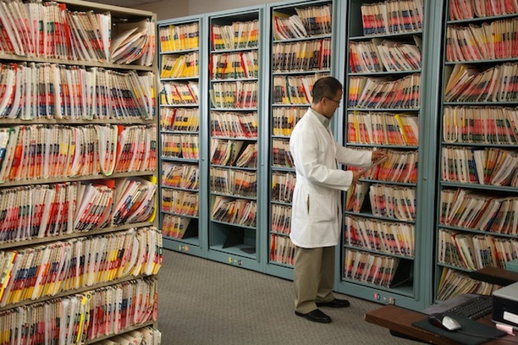
Other challenges are more complex. Reliance on paper records is a significant obstacle. As of recent reports, 4% of NHS trusts rely entirely on paper records, while 75% use a hybrid of paper and digital systems. Digitising paper records, whether manually or through AI, is a time-consuming task and demands a high degree of accuracy.

This raises some important questions:

  • How would a new digital system be implemented?
  • Would it replace all existing systems entirely?
  • How would patient data be migrated?

One proposed solution is to register only patients born after the new system’s introduction on the updated platform. However, this poses its own dilemma: should existing patients be migrated, with the associated risks of data errors, especially from paper-based records, or should their information remain on legacy systems, effectively requiring parallel systems to operate for decades?

Newer technologies offer promising capabilities, such as compatibility with modern software upgrades. In one case, a simple software driver update resulted in a 16% improvement in processing speed.

However, even the most advanced system will falter without proper staff training and engagement. If staff are unable or unwilling to adopt new systems effectively, then progress will be severely hampered. Furthermore, improper use of the system, such as mislabelled drop-down options or poorly structured free-text entries, can severely compromise data quality and any resulting analysis.

As such, buy-in from the leadership is crucial. NHS leaders must champion the use of new systems and ensure correct usage. This enables high-quality data collection, which can then be used for real-time analytics and automated dashboards. Without such buy-in, there is a risk of staff reverting to unofficial workarounds, undermining the new system.

Despite the challenges, there are some bright spots. Some NHS services have successfully adopted innovations, such as automated bed management systems that track real-time availability, and image recognition technologies aiding in cancer diagnoses and blood cell analysis. These examples offer a glimpse of what is possible when digital transformation is embraced.

Confessions of a Data Hoarder: Why Good Data Management Still Matters

My name is Donald, and I have a confession to make.

Until yesterday, the data on my home external storage was in a sorry state. Duplicate files, random folders with even more random names… it was chaos. I know some of you are now probably rushing to the bathroom to vomit at my poor data management skills – and for that, I sincerely apologise.

So, is good data management still important in an age of powerful indexing and search tools?

I once read an article suggesting that emails should only be sorted into three simple categories – To Do, Current, and Done – with no further refinement. The idea was that time spent over-organising could be saved by relying on the email client’s search function. To be honest, that does work in some cases.

But in others – especially legal or business-critical scenarios – poor organisation can be disastrous. For eample, the case of Zubulake v. UBS Warburg, a landmark sex discrimination lawsuit. UBS couldn’t locate key emails during the trial, which contributed to them losing the case. The result? Sanctions, legal fees, and a very expensive lesson in the importance of data management.

In my experience, well-organised data often follows a hierarchical folder structure – grouping related files together, making them easier to locate and manage. This benefits both human users and indexing systems. Searching becomes faster, errors are reduced, and data integrity is easier to maintain.

On the other hand, when similar data is scattered haphazardly across random folders, systems, and even storage types – Cat5 cables here, USB drives there, Wi-Fi transfers elsewhere – it can lead to critical issues. Old or incorrect data might be used in analysis. Search indexing slows down. Money and time is wasted

So yes, modern computers are good at finding things – but ultimately, good data management is about helping people. A clear, consistent folder structure allows users to explore, locate, and make sense of their data more intuitively. This allows search tools to become even more powerful.

Why GIS Skills are Essential for Data Analysts

The field of data analysis is an extremely wide ranging and large one. Indeed there are so many aspects to data analysis, that it would be impossible for any one individual to become an expert in all of its specialties.

That being said, any analyst who is working with geographic data of any sort, should be aware of GIS and its influence on any analysis being carried out. While other forms of analysis can be carried out without a geographic component, GIS analysis allows an extra dimension to be examined and analysed.

An interactive dashboard or graphic can be useful for demonstrating some information, but without data broken down into geographic regions, then some important insights may be missed. A geographic dashboard can display rates of disease or vaccination by area, allowing analysts and users to see whether there is a geographic component to these questions, and to then ascertain if there is another link, such as ethnicity, language or culture, which may explain a lack in vaccination uptake.

GIS skills are especially useful for Data Analysts working in healthcare. At the start of COVID-19, there were several geographic dashboards, showing the spread of the disease as well as the spread of fatalities.

There are also ethnic groups, who are more susceptible to certain illnesses, examples of which include the Afro-Caribbean population, who are more likely to suffer from sickle cell anaemia, and people of Polish descent, who have a higher breast of breast cancer and ovarian cancer. By understanding where these groups may live within a large city, can enable a higher level of bespoke medical treatment to be made available to them.

Using limited resources in targeted areas would improve the healthcare of those susceptible to genetic illnesses, while allowing efficiencies to be made by limiting the wastage of resources for populations, who have less of a requirement for them.

Geospatial Artificial Intelligence

So what is Geospatial Artificial Intelligence (GeoAI)? Essentially it is the fusion of AI technologies with geospatial data and systems. This would allow more sophisticated analysis to be carried out, which to date, either has not been possible, or would take a much longer time to process.

Key Definitions

Artificial Intelligence (AI) uses computers to mimic human intelligence by using logic, decision trees and if-then rules.

Within the field of AI is machine learning (ML), which uses statistical techniques allowing computers to carry out improved analysis. One example of this would be supervised classification of satellite imagery to identify ground types such as concrete, water, grass, etc.

Within ML is deep learning (DL), which uses algorithms for software to train itself in skills such as speech and image recognition, through the use of neural networks.

Possible Uses

One use would be for the extraction of building footprints from satellite or aerial imagery. If a new building is found within an area of interest, then the GeoAI could search through its imagery archive to find the structure being built and extract floor plans for the whole building. Additionally this tool could be used for rapidly ascertaining compound extents and numbering them within an area of operations.

Another possible use would be the identification of ‘safe lanes’ through anti-personnel minefields in war zones. Usually the local population will have knowledge of the location of these devices. There may be local ad hoc signs of mines, such as white rocks and arrows on the ground. A GeoAI would be able to compare imagery from different dates to identify ‘paths of desire’ which could identify a safe route.

The identification of socio-economic zones would be useful within an urban setting. An example of this can be seen within this imagery of Berlin, denoting the partition of East and West Berlin through the use of streetlights. With enhanced technology and greater resolution, then further refinement of socio-economic status can be made.

During times of civil disturbance, then GeoAI could be used to search for tweets, identifying key words and then plot them on a map. This could then be used to ascertain the current location of any protestors, as well as their possible future intentions. Ideally surveillance of tweets may be able to identify possible hot spots relating to civil disturbance and allow authorities to prevent a riot before it starts.

GeoAI is currently being used within Germany in order to show roads with high traffic and then use this knowledge to predict which roads and areas are the top priority for maintenance.

Concerns

There are several high profile technologists who are concerned about the rise of AI, especially if it is allowed to progress without any safeguards.

Additionally, there are concerns about AI and the potential for job losses within certain fields. While there may not be an office of T800s completing paperwork, there may be a computer buzzing away in a corner, answering HR queries and processing claims.

Within AI, training data is used to teach the AI how to identify certain features and objects. But if the training data is incorrect, or widely biased, then the output will also be incorrect, leading to poor conclusions being drawn from the data.

Additionally AI has been shown to be able to lie, and also of under stating its own capabilities. ChatGPT has also been shown to provide incorrect information in certain circumstances.

Conclusion

With great power, there must also come great responsibility. As with all new technologies, there is the promise of technical progress, but also the threat of the loss of jobs. There should also be safeguards placed onto AI, and care taken when examining any data provided by AI.

Creation of a Medical Services AGOL Dashboard

I decided to update a previously completed AGOL Dashboard showing Medical Services available within North Central London.

The new app uses the Nearby Instant App from AGOL and can be found here. Users can input a location or use their current location, and then filter locations by services, and also by distance from their chosen location.

The script can be found here.

There were a few reasons why I decided to do this:

– I thought it would be good to update this for Cambridgeshire.
– I needed to change the code, as the initial code used the arcpy Python library, which I no longer have access to.
– I also wanted to update the code, as the original code ran on a AGOL Python notebook, and I wanted my new code to run on my Raspberry Pi, as it would be easier for this code to be automated at a future date.

1 – Had to create a new Postcodes file in order to act as a filter for Cambridgeshire.
2 – Changed the co-ordinates for my NHS facilities API.
3 – Combined all the required datasets into a single pandas dataframe (Clinics, Dentists, GPs, Hospitals, Opticians, Pharmacies).
4 – Pulled out the contact phone number from the Contacts field, which contained phone numbers, fax numbers, websites etc.
5 – Created a new dataframe and extracted the services, which were originally in a wide format into a long format. This increases the data size, but makes it easier to filter by service type.
6 – Created a new dataframe and extracted the opening times, from a wide format into a long format.
7 – Used the geopandas library to create a geodataframe from a normal dataframe.
8 – Created a shapefile for each geodataframe.
9 – Zipped the shapefile files for easier use.
10 – Emailed the zipped shapefiles for myself so that I can upload them to AGOL.

Please let me know your thoughts, or if you want me to create one for a particular part of the country.

A Tale of Two Python Scripts to Solve Sudoku Puzzles

Last year, I wrote a script to help me solve Sudoku puzzles. There were two reasons for this; the first was to improve my Python programming skills and the second was see whether I could actually do it!

Version One of the script used a user generated CSV file as the input, and would look at the grid. First it would look for the first empty cell, then look at the numbers in the same row, then column and then 3×3 grid.

It would create an array from 1 to 9, and then remove any numbers found in the previous search. If there was one number remaining, then it would put that number into the cell.

This process would be repeated until two runs of the process had the same number of spaces i.e. no more numbers were able to be input into the grid.

It would print the Sudoku grid, regardless of whether or not it had been completed.

While this process was largely successful for simple puzzles, it was prone to failure for more difficult puzzles.

One solution which I devised for the unsolved cells problem was to populate any persistently empty cells with a random number from the cell’s array. It would then continue the process to solve it, and if unsolvable, the whole script would start again from scratch.

This solution proved to be unreliable and as such, would continue to process until infinity, without solving the puzzle.

Version Two of the script used a similar process. However there would only be one overall pass of the procedure, and it would always generate a result.

First it would check every cell, and then skip the cell if there was a number already in it. If the cell was empty, then the cell would be filled with a zero value. The check for values in the same row, column and 3×3 grid would be carried out, and then the lowest available number would be put into that cell.

This is different from the first script in that every cell being processed would have a value assigned to it. However, if a future cell was found to be unsolvable, i.e. no numbers could be input into the cell without breaking the rules of Sudoku, then the previous cell would be re-examined with the next available number being input into it.

This means that there would be a back and forth with the puzzle cursor until the puzzle was solved.

Please let me know your thoughts on this or any ways I could improve the puzzle solving process of that scripts!

A Map Can Paint A Thousand Words

Today, we’ll examine two websites designed to present geographic information to the public.

Website One: Reporting Potholes

NI Direct – Report a Problem

This Northern Ireland-based tool allows users to pinpoint pothole locations on a map. By visualising reports, local authorities can identify high-risk areas and prioritise repairs. Additionally, it helps motorists claim compensation for vehicle damage caused by potholes.

Website Two: Parade Notifications

Parades Commission

This website provides details on public parades across Northern Ireland. Given the potential for parades to be contentious, authorities and the public must be aware of their locations. The site lists roads affected, start and end times, and the number of participants.

Comparison

The pothole reporting tool leverages mapping to highlight problem areas, allowing users to spot trends and compare locations easily. It gives a precise location of a pothole, rather than a road name or a vague location.

The parade listings, however, provide only textual route descriptions. While the local population may recognise these locations, the lack of a mapping feature makes it difficult for the broader public to visualise the routes or identify patterns.

Without geographic visualisation, meaningful insights — such as recurring parade routes or overlaps with other events — are harder to discern.

Conclusion

GIS and mapping add crucial context to location-based questions. While analytics and dashboards provide valuable insights, omitting spatial visualisation leaves half of the picture missing. Integrating maps into public information tools enhances clarity, enables pattern recognition, and improves the decision making process.

Demonstrating Leadership through Star Trek

This post will be concentrating on Leadership and Management viewed through a Star Trek – The Next Generation episode – Gambit Part II.

Situation

Capt Picard and Cdr Riker are off-ship and Lt Cdr Data is in temporary command with Lt Worf as his temporary First Officer. Both are acting in unfamiliar roles and are adjusting to their new leadership responsibilities.

Lt Worf’s intense desire to become a part of his lost Klingon culture was matched by enduring loyalty to the world that adopted him in his darkest hour. Those impulses forged a character of indomitable courage, integrity and uncompromising idealism. With his limited contact with his own people, he subscribed to an idealised version of his Klingon culture.

Lt Cdr Data is an artificially created android, who is unable to experience emotions. In some ways, he is similar to Spock from the original series, regarding their lack of emotions. As he was found by Starfleet, he decided to join them and served on various starships during his career. He attempts to emulate emotions from his crewmates with varying degrees of success.

[Ready room]
*** Private Feedback – First it should be noted that this discussion is taking place away from the bridge in private. This emphasises the doctrine of praise in public, but rebuke in private.

DATA: Lieutenant, I am dissatisfied with your performance as First Officer.
WORF: May I ask in what way?
DATA: You continually question my orders in front of the crew. I do not believe this is appropriate behaviour.

*** Making The Issue Clear – Here a reprimand is being issued in plain and unambiguous language. There is no dancing around the issue or euphemisms being used. Also when asked to clarify, Data is able to offer clear examples.

WORF: With all due respect, sir, I have always felt free to voice my opinions even when they differ from those of Captain Picard or Commander Riker.
DATA: That is true. But in those situations, you were acting as Head of Security, not as First Officer. The primary role of the second in command is to carry out the decisions of the Captain in this case, me.

*** Attempting To Justify The Issue – A justification is being offered to defend from the reprimand. The justification is acknowledged, but it is stated that the situations are different, with a different role being undertaken by Worf.

WORF: But is it not my duty to offer you alternatives?
DATA: Yes. But once I have made a decision, it is your job to carry it out regardless of how you may personally feel. Any further objections should be given to me in private, not in front of the crew. I do not recall Commander Riker ever publicly showing irritation with his Captain as you did a moment ago.
WORF: No, sir.

*** New Role Responsibilities – A further justification is given, and again it has been acknowledged. However additional guidance is given regarding the responsibilities of this new role, using examples of the previous First Officer. 

Worf showing irritation is part of his Klingon culture, where First Officers serving on Klingon ships can kill the captain if they believe they are deficient and can then take their place.
Data being an android is immune to irritation, and lacks emotions, and so is able to analyse situations in a purely logical light.

DATA: If you do not feel capable of carrying out this role, I will assign it to Commander La Forge and return you to Tactical. I would not enter it into your record as a reprimand, simply as a transfer.

*** Offering An Exit – An exit route has been provided, should it be required. There is an element of mercy here as well, and there would be no negative consequences if this course of action is taken.

WORF: I would prefer to remain at my current post.
DATA: Then I expect you to conform to the guidelines I have laid out.
WORF: Aye, sir.

*** Accepting Your Mistakes – The exit route is not taken, and as such, a reminder is given by Data regarding the responsibilities of a new role. Again, Worf as a Klingon accepts responsibility and does not shirk it, as it would be dishonourable to himself and his culture.

DATA: Dismissed. Mister Worf, I am sorry if I have ended our friendship.
WORF: Sir, it is I who has jeopardised our friendship, not you. If you will overlook this incident, I would like to continue to consider you my friend.
DATA: I would like that as well.
WORF: Thank you, sir.

*** Owning Your Mistakes – A personal apology is offered regarding their friendship. Worf accepts responsibility and asks Data to overlook the incident. He is not being ignorantly proud and refusing to continue his friendship with Data.

Being a leader does not come naturally to most people, which is why the Armed Forces ensure each promotion comes with training and education regarding responsibilities of this new promotion.

It is also important to understand that as a leader, you will make mistakes, which will affect people, both senior to you and junior to you. But the most important thing is how you handle those mistakes, and whether you acknowledge them (like Lt Worf) or refuse to admit your have made a mistake.

Thoughts on Maps

Maps are more than just tools for navigation; they are windows into how we understand the world. From ancient hand-drawn charts to modern digital maps, they represent our attempts to make sense of complex spaces, both physical and conceptual. A map can guide you through a city’s tangled streets or help you navigate a mountain trail, but it can also show the distribution of ideas, languages, and even emotions across landscapes.

What fascinates me about maps is how they frame reality. Every map is a selective view, highlighting some aspects of the world while leaving others out. This can shape how we see the world, influencing everything from our travel plans to geopolitical perspectives. Maps can empower or mislead depending on how they’re used.

In today’s digital age, interactive maps offer dynamic insights into everything from environmental changes to social movements. Yet, the beauty of a physical map, with its permanence and artistry, remains timeless. Whether we’re tracking our daily commute or exploring distant countries, maps are a powerful reminder of the interconnectedness of our world and our desire to chart the unknown. They encourage us to look beyond the horizon and explore what lies ahead.