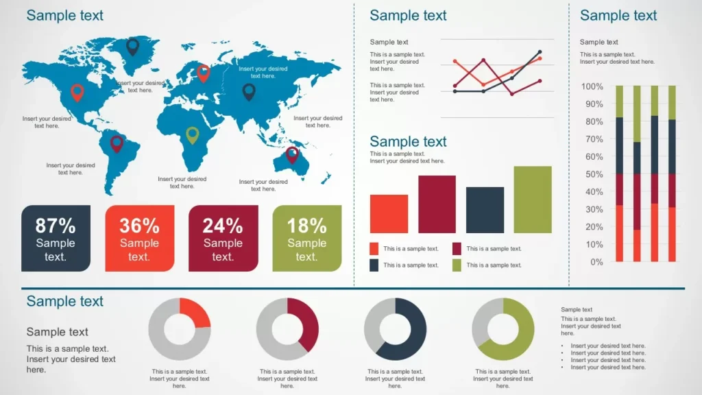
Today, I’ll provide a brief overview of a practical process that transforms original, non-geographic data into an interactive GIS dashboard.

End User Requirements
While it may be tempting to jump straight into the technical side, it’s crucial to start by understanding the end user’s requirements. This often involves clear communication to grasp their overall goals and to understand the question which needs to be answered. You may be working with multiple stakeholders, both internal and external, which can require a large amount of negotiation around user requirements and enforced constraints.
Will it be a one off product, or will it need to be updated on a regular basis? Some data will be regularly updated on a pre-defined schedule, while other data may be updated at irregular intervals. Census data is updated every ten years, while some medical datasets are updated on a monthly or bi-weekly basis.

Source Data Acquisition
The next step is identifying the source data— especially regarding its location and format. Is it available via an API or stored in Excel spreadsheets? Was it submitted through online forms, allowing for some automation? Or, less ideally, was it saved as JPEGs or XPS files, or even handwritten notes tucked away in a filing cabinet like a relic from the Stone Age?

Source Data Limitations
Data is often restricted for a variety of reasons. For example, patient or crime location data must be anonymised before public release. If you’re lucky, the dataset is already open source and free of restrictions.
In some cases, national security classifications (e.g., USUK access controls) may prevent data sharing. Even unclassified data may be restricted if its method of collection is sensitive.

Data Processing
Unless you’re extraordinarily fortunate, the raw data will need cleaning and transformation.
You might begin with Excel to identify necessary changes and to see the data at all times, and the effects of your data manipulation. Tools like PowerBI or ArcGIS Toolbox offer accessible and visual methods for data processing. I’ve also used Python extensively for its versatility and ability to automate complex workflows.
There may be some limitations, which can be worked around, or other limitations, which can be shop-stoppers. For example, downloading a dataset as an Excel spreadsheet may not be able to be automated, according to which solution you choose. This would result in a step in the process, where you have to manually click a button in order to upload a file for processing.

Data Presentation
ArcGIS Online (AGOL) provides multiple options for presenting your data—interactive dashboards, web apps, and Experience Builder templates among them.
Designing a dashboard that balances user needs and organisational design standards can be tricky. Effective use of symbols and color schemes helps make outputs accessible to non-experts. I’ve also created guides to improve the user experience and added disclaimers to clarify data limitations.
Another key factor is device compatibility. A dashboard optimised for widescreen monitors might need redesigning for mobile devices. Layout, symbology sizing, and legend placement should all be tested and refined.

Continuous User Engagement
Engagement with end users should continue throughout the development process. Avoid the temptation of a strict waterfall approach, which can restrict communication with the end user. Instead, aim to deliver a minimum viable product and iteratively improve it. This leads to better feedback, smoother development, and a more satisfying user experience.
